
Realestate analysis with MapBox and Turf
Couple months ago I was thinking about buying a flat in Prague. That is pretty bold decision and requires some analysis before. Before looking further into the market I was looking for a web that would give me the average prices per meter in different city regions. I didn’t find anything and since I have always liked building stuff around maps I have created a simple web page. Everything is in JavaScript besides the backend part for gathering the data, which is F#.
Last time that I played with maps, google maps were pretty much the only way around (yes that was couple years ago). These days more frameworks are available. One particular solution got my attention: Mapbox and it’s ecosystem. I ended up using mapbbox, turf.js and leafletjs which have quite a lot of built-in analysis and visualization features. At the end I was able to get pretty cool interpolation using hexagonal grid system, backed up by triangulated interpolated network.
And I have also created a visualization to see the city prices by city districts, which is quite easy to create, assuming that you have the geographic data of quarters (Prague has an open data service).
The whole thing can be found at www.flatpricer.com
Data model
I have gathered the data by screen-scrapping few reality servers. On the backend I was using C#, but quickly went over to F#, since HtmlTypeProvider and CsvTypeProvider helped me a lot to gather the data. Then there was a question of how to serve the data. I have decided the best would be for the server to provide already valid geojson data, which would work fine with the JS frontend libraries. In order to generate such valid geojson I would have to create an F# model mirroring the structure of the geojson format. Before we get to that, let’s see how I store the flats and their locations:
type Location = {
    Lat:float
    Lng:float
}

type Flat = {
    Address:string
    Price: float
    Timestamp: DateTime
    Surface : float
    CityPart : string
    Location: Location option
} with member this.Pms = this.Price / this.Surface
That is the actual domain model. I have also created a set of classes that when serialized would return valid geo-json.
type GeometryType =
    | Polygon
    | Point

type Geometry = {
    Type:GeometryType
    Coordinates: float list
}

type Feature = {
    Type: string
    Geometry:Geometry
    Properties:Flat
}

type FeatureCollection = {
    Type:string
    Features: Feature list
}
Note that if I want to provide a set of flats as geo-json I would just have to create FeatureCollection object and convert each flat to a Feature. You can see that in this model the Properties field of the Feature is of type Flat. I am simply adding the flat as metadata to each feature which it represents. Properties is just a generic JSON object and can take anything, here I have decided to type it directly to flats here because I will always be passing the flat as metadata. One could probably create a generic record as well.
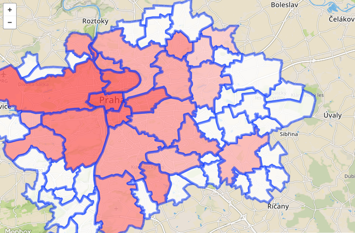
City quarters prices
In order to visualize the average prices per city region, one needs a geojson map of the city. Prague has an open data service which provides several different maps as geojson, one of them is the simple city regions map. The data is available on the Geoportal. The geojson itself is quite big 1.5Mb, because of the precision of the map. I have run it through http://www.mapshaper.org/ in order to make it smaller without loosing much precision.
The geojson file contains some global information and then list of Features, each of them representing one city part. Feature is composed of a polygon, defined using list of location points and metadata stored aside in properties field.
I am using Knockout.JS as MVVM framework to wire everything together behind the scene, but I suppose any decent JavaScript framework would do the job. I have removed all references to it from the snippets.
As I said I have already calculated the average price of each city part on the server, now it’s just the matter of visualization. The following code would load the geo-json into memory and then specify a function to determine how each polygon should be shown. For each polygon I would use the name of the city part, found in the properties metadata of each feature. I would than get the Average Price Per Meter Squared (avgPms) and use it to get the color.
var cityParts = //... load the city parts collection from the server
var cityPartsLayer = L.geoJson(cityPartJson, {
  pointToLayer: L.mapbox.marker.style,
  style: function(feature) {
    var partName = feature.properties.NAZEV;

    var part = find(citiParts, function(p) {
        return p.cityPart === partName;
    });

    var color = "#FFF";
    if (part) {
        color = partsColorScale(part.avgPms);
        feature.properties = part;
    }

    return {
        "fillColor": color,
        "fillOpacity": 0.8
    }
  }
}).addTo(map);
I am using a partsColorScale function above which returns the appropriate color for given value. To define this function I would use standard D3.js color scale. If you know your minimal and maximal values then the scale can be defined simply as:
Note that above I would also take the data for the city part and store them in the properties data of the feature, we will use them later when adding action for the click on the given feature. For that we would also need the object that we have created which is a Mapbox layer.
var partsColorScale = d3.scale.linear()
    .domain([data.minPms, data.maxPms])
    .interpolate(d3.interpolateRgb)
    .range(["white", "red"]);
The last step would be to add click event handler. We can do that by attaching a function to the click event of the Mapbox layer. This function takes as parameter, which contains some mouse event information such as position of the cursor, but it holds also the layer, which we can use to access the feature and the metadata that we have stored there before.
cityPartsLayer.on("click", function (e) {
    var content = "<b>"+e.layer.feature.properties.cityPart +"</b>: " + e.layer.feature.properties.avgPms.toFixed(2);
    self.popup
        .setLatLng(e.latlng)
        .setContent(content)
        .openOn(map);
});
Triangular interpolation network
The aim of this part is to create something similar to the following visualization. TIN is a network in which each point is connected to two other points in such way that together they form a convex polygon and none of the connection lines crosses other line. Such network can be then used to interpolate a value anywhere on the map within this convex polygon. The idea is that any point on the map fits into one of the triangles and within this triangle the price can be linearly interpolated, by looking at how close the point is to each of the three nodes of the triangle. Constructing such network efficiently would require quite smart algorithm. [citation needed]. This is where Turf.js comes in place.
Turf exposes a method which takes a simple FeaturesCollection object, that holds a list of features each of them being a point with properties. Alongside we to Turf.js only the name of the property containing the value that we want to interpolate.
var tins = turf.tin(data, 'pms');
Very easy. Before going there however I figured out that network would get quite dense in some places and sparse in others. The problem were the really dense places, which actually caused the TIN network to be invalid. The network would contain crossing lines and therefor overlapping triangles as shown bellow.
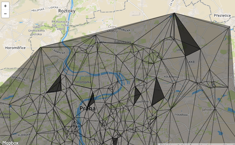
I suppose that could be marked as bug in Turf, but in reality it also shows that my data is not that good, because if there are really two flats few meters from each other, it does not make sense to construct a triangle around them to interpolate prices. We could just take the average.
Merging very close points
So basically what I wanted to do, would be to cluster the really close points together, make one point from them with average price per meter. I came up with the following not really efficient greedy algorithm, that just loops over the points, looks if there is a cluster available in certain distance and if not creates one. The centers of the clusters would not move.
function(data, distance)
{
    var buffers = [];
    var findBuffer = function (point) {
        for (var i = 0; i < buffers.length; i++) {
            var b = buffers[i];
            if (turf.inside(point, b.buffer))
                return b;

        }
        return null;
    }
    data.forEach(function (f) {

        var buf = findBuffer(f);
        if (!buf) {
            buf = turf.buffer(f, distance, 'meters');
            buffers.push({
                "buffer": buf.features[0],
                "points": [f],
                "avg": f.properties.pms
            });
        } else {
            buf.points.push(f);
            buf.avg = (buf.avg + f.properties.pms) / buf.points.length;
        }
    });

    return {
        "type": "FeaturesCollection",
        "features": buffers.map(function (b) {
            return b.points[0];
        })
    };
}
I am using two Turf methods here: buffer creates a circle around the point that we can handle as geo-json feature. That means that I can use it fine with other turf methods and I can also attach properties to it like to any geo-json feature. The second turf method is inside, which checks for any new point whether it is in one of the existing buffers (clusters). The method return FeaturesCollection compatible with other turf and mapbox methods, that can be passed directly to the tin method to calculate the triangular network.
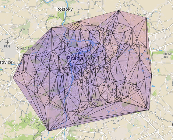
This time the network would be without crossing lines and with no useless small triangles. Here is how to actually add the TIN layer object to the map.
var tins = turf.tin(data, 'pms');
var tinsLayer = L.geoJson(tins, {
    pointToLayer: L.mapbox.marker.style,
    style: function(feature) {
        var avgTrianglePms = (feature.properties.a + feature.properties.b + feature.properties.c) / 3;
        var style = {
            "weight": 1,
            "color": "black",
            "fillOpacity": 0.4,
            "fillColor": partColorScale(avgTrianglePms)
        }

        return style;
    }
}).addTo(map);
Above we are using the average of the 3 points of the triangle to decide the color which we should attribute to it. But as said before there is a way to interpolate the value anywhere on the map using the TIN network. We could add a click handler for that.
    self.tinsLayer.on("click", function (e) {
        var point = turf.point([e.latlng.lng, e.latlng.lat]);
        var value = turf.planepoint(point, e.layer.feature).toString();
        popup
            .setLatLng(e.latlng)
            .setContent(value)
            .openOn(map);
    });
First we need the coordinates of the point on which have clicked, then we can pass it to planepoint, which takes besides the feature representing the feature representing the triangle inside TIN. This returns the interpolated value which can be shown with a simple popup.
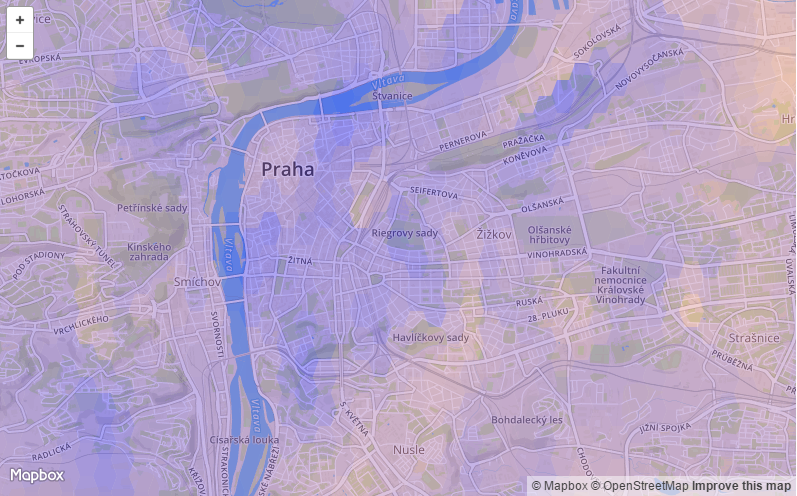
Hexagonal grid
Another and maybe better way to get better idea about the prices would be to use hexagonal grid. Of course simple grid could be used as well, but using hexagonal grids will give you more detail then simple rectangular grid.
There are couple ways to implement this. The simplest one would be just to iterate over the grid and for each hexagon find the flats inside it’s area and then take average or median value. The problem with this approach is that you will probably get a lot of empty grids, since flats are not regularly distributed.
One way around this is to use the triangular network that we already have. The network covers completely the city. We can iterate over the grid get the center of each cell and see what it’s value would be in the TIN. We can create the hex grid over which we iterate later with turf’s hexGrid method which takes the bounds as parameters.
var hexgrid = turf.hexGrid([14.35, 50.02, 14.5, 50.12], 0.8);

var filledGrid = hexgrid.features.map(function (grid) {
    var center = turf.center(grid);
    self.tins.features.forEach(function(triangle) {
        var isInTriangle = turf.inside(center, triangle);
        if (isInTriangle) {
            var value = turf.planepoint(center, triangle);
            grid.properties.avgPms = value;
        }

    });
    return grid;
});

var hexGridLayer = L.geoJson(filledGrid, {
    pointToLayer: L.mapbox.marker.style,
    style: function(feature) {
        var style = {
            "weight": 0,
            "color": "black",
            "fillOpacity": 0.4,
            "fillColor": self.cityPartColorScale(feature.properties.avgPms)
        }

        return style;
    }
});
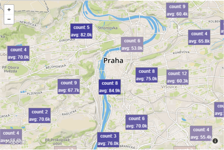
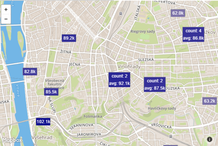
Clustering with leaflet
As the last type of visualization I wanted something that would naturally cluster the markers on the map, with automatic decomposition of the cluster while zooming in. It turns out this is easy with leaftlet.js and it’s cluster plugin.
var clusteredFlats = new L.MarkerClusterGroup();
var flatsLayers = L.geoJson(flats);

flatsLayers.eachLayer(function (f) {
    var desc = JSON.stringify(f.feature.properties);
    f.bindPopup(desc);
    clusteredFlats.addLayer(f);
});

map.addLayer(self.clusteredFlats);
This is very easy specially if you already have the collection of the points as valid GeoJson (in my case the flats) property. The MarkerClusterGroup (available in the leaflet cluster plugin) contains a method addLayer which adds a single layer to the cluster. So we have to only convert the GeoJson to layers collection.
Note that here are I am also adding popup, which will contain all the properties of the maker serialized to json string.
If you want to achieve custom styling of markers and clusters as I did, then you have to add a bit more code. Adding custom icon to the markers can be achieved within the loop that adds the flats to the cluster.
self.flatsLayer.eachLayer(function (f) {
      var pms = self.formatPms(f.feature.properties.pms);
      var color = self.colorScale(f.feature.properties.pms);
      f.setIcon(new L.DivIcon({
          iconSize: [40, 20],
          html: '<div style="color:#fff;background:' + color+ '">' + pms + '</div>'
      }));
      self.clusteredFlats.addLayer(f);
  });
Note that I have also added a method to format the prices per meter to safe some space, that is used in the markers code above.
self.formatPms = function(pms) {
    return (pms / 1000).toFixed(1) + "k";
}
Styling the clusters requires passing a styling function to the MarkerClusterGroup constructor. As it was the case above with the marker’s icon I have used the DivIcon function to which takes the size and html.
self.clusteredFlats = new L.MarkerClusterGroup({
    iconCreateFunction: function (cluster) {
        var clusterPms = self.getClusterAveragePms(cluster);
        var color = self.colorScale(clusterPms);
        return new L.DivIcon({
            iconSize: [60, 40],
            html: '<div style="text-align:center;color:#fff;background:'+color+'">count: ' + cluster.getChildCount() + '<br/>avg: ' + self.formatPms(clusterPms) + '</div>'
        });
    }
});
Note that there are simpler ways to style the marker, if you want just to change the color or size of the default marker’s icon you could use the default styling icon function.
As you might have remarked the clusters icon’s shows the average price per meter in the given cluster. The following functions calculates the price per cluster.
self.getClusterAveragePms = function(cluster) {
    if (cluster._markers.length > 0) {
        var totalPms = cluster._markers.map(function (m) {
            return m.feature.properties.pms;
        }).reduce(function (m1, m2) {
            return m1 + m2;
        });
        return totalPms / cluster._markers.length;
    } else {
        var clusterAvgs = cluster._childClusters.map(self.getClusterAveragePms);
        return clusterAvgs.reduce(function(a, b) { return a + b; }) / clusterAvgs.length;
    }
};
Each cluster contains either markers or child clusters. Either we take the average of the markers within the cluster or the average of the child clusters. This method has two flaws that I have omitted for now. It does not handle the case when a cluster is compose of clusters and valence markers and the average of child clusters is not weighted. The child clusters have different number of markers and so a weighted average should be used with respect to the cardinality of the cluster.
Histogram of prices
Since we have already all the flats loaded in memory we can profit and create a histogram of the flats with respect to the price per meter squared (PMS). I have been using D3JS and there is no better tool for charting. If you are interested in out-of-the-box charts you might pick one of the libraries based on D3JS, in this case, let’s assume only think we have is D3.
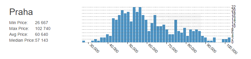
Splitting the prices into buckets
D3Js contains a method that will split the prices into buckets (bins), one just needs to provide the number of buckets.
var histogramData = d3.layout.histogram()
    .frequency(true)
    .bins(80)(data);
Charting the buckets
For the chart itself you just need to find a div and transform it into SVG element.
var svg = el.append("svg")
    .attr("width", 800)
    .attr("height", 500)
    .append("g")
    .attr("transform", "translate(" + 10 + "," + 10 + ")");
One also needs to defined the X and Y scales, which are used to translate from real-world dimension to the target chart dimensions. For Y axis it will be a linear translation from the number of occurrences to the height of each bar in pixels.
var x = d3.scale.linear().domain([0, 100]).range([0, dims.width-10]);
var y = d3.scale.linear().domain([0, d3.max(histogramData, function(d) { return d.y; })]).range([dims.height, 0]);
Once we have the scales, we can define each bar of the chart. We don’t draw them yet, just define the svg elements for them. Each bar is translated on the x-axis relatively to the X and Y values.
var bar = svg.selectAll(".bar")
   .data(histogramData)
 .enter().append("g")
   .attr("class", "bar")
   .attr("transform", function (d) {
       return "translate(" + x(d.x) + "," + y(d.y) + ")";
   });
And the last step is to draw the bars. We will take the “bar” svg elements from the previous snippet and append a rectangle to each. The height of the rectangle is proportional to the number of flats in the bucket.
bar.append("rect")
   .attr("x", 1)
   .attr("width",columnWidth)
   .attr("height", function(d) {
       return dims.height - y(d.y);
   })
   .attr("fill","#1f77b4")
   .attr("opacity",0.8)
There is a bit more to it, like handling the mouse events, adding the legend and so on. I have been using this template from my small charting project for histograms, which you can customize or inspire yourself.